Do you ever wonder why your favorite color is your favorite color? Or why you remember distinct logo’s better than others? Did you know we subconsciously seek out symmetry? What happens when we take symmetry out?
This article will display the subtle psychology of web design and how even the smallest parts of your website can leave a lasting impression. We’ll discuss what role psychology plays in the art of web design and how it affects us. The process of designing a website is extremely complex and often time underestimated in many web projects.
Most developers who are starting off such as novice freelancers often create websites without much thought, their websites usually look unmotivated and unappealing. However, Professional web designers know the importance of web design. More importantly, they understand the psychology behind it all and the significance in the way people may perceive their website.
The Subtle Psychology Of Web Design: What Is Psychology? And What Role Does It Play?
Before we continue on to the use of psychology in web design, let’s get a good understanding of what psychology is. Psychology is the science of mind and behavior, this includes the study of conscious and unconscious phenomena, including emotions and thoughts. It’s an academic discipline of immense scope, crossing the boundaries between the natural and social sciences. Now you’re most likely wondering why this would play such a big role in web design and development. Psychology plays a massive role in almost everything we do, from decision making like what we feel like eating to marketing on the best fish bait to use in Alaska. Somewhere along that spectrum is where the psychology of web design is, the role it plays is just as impactful as the overall reason as to why the website was developed in the first place.
Importance Of Color Schemes
Colors play an essential part when it comes to web design. Colors are usually chosen based off of the idea behind the website and what emotion you’d like to trigger. Colors are associated with different types of moods and emotions. There are thousands of colors and and millions of combinations. Each one of these can trigger and emotionally impact anyone while still maintaining another use consistently.
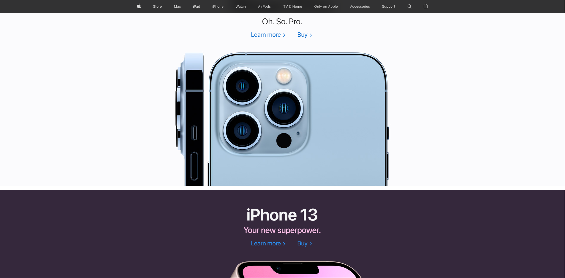
The particular color scheme you choose can affect all consumers who navigate to your website, an example of this is the color blue. Blue promotes calmness and may cause people to stay on your page longer because of that trigger. While the color black is embracing the idea of sleek luxury, think of Apple’s marketing and how they branded themselves originally with their iPhones. A more visual example to this would be using the color yellow as a call to action button as it would trigger excitement and energy.
Now, imagine the use of these colors in day to day life that are particularly used in such a way where you will be subconsciously navigated and influenced before you even realize what the website is about. Certain website designers use blues and greens in certain parts of their website that they’d want you to navigate towards, while using hues and neutrals in areas that aren’t as important. The human brain will subconsciously always try to fill in the blanks, so in these scenarios websites with neutral dead space or thin content can be manipulated on purpose to be that way just so that your eyes will navigate to their blue and green color scheme section which will usually be integrated near their call to actions.
The Psychological Meaning Behind Colors In Web Design
What these colors do and mean:
Red Symbolizes fire and power and is usually associated with passion and importance. It stimulates and triggers excitement or energy. However, there are negatives to the color red. It can also be associated with rage, emergencies, and anger. Which are just absolutes of passion which can trigger aggressive qualities.
Orange Combination color, usually used to enhance red and yellow. It is used to symbolize joy, sunshine and happiness. Triggering a cheerful and innocent feeling. But, just like all colors it also has a negative that it can trigger which is usually associated with stimulating deceit.
Yellow is another color that is all about happiness and positivity; it can trigger the idea and emotion behind optimism. Usually associated with Intelligence and brightness. However, a darker hue of yellow could bring you a more dark approach which can be used to trigger emotions associated with negative feelings such as laziness, critics and jealousy.
Green represents nature and healing, it can be used to trigger emotions based around growth and unity. People are usually attracted to green because of its association to safety. Some of the negatives around using green is the fact that its mainly used to symbolize money and greed. It can also be used to symbolize a beginner or lack of experience.
Blue A more peaceful and relaxing color that radiates stability and pure expertise. It is an extremely commonly used color because of how you could use it. It also triggers trust, having using blue on websites, its way better to use the color blue when you are trying to portray a more serious message. But, of course hues of blue could trigger a more melancholy emotion which is usually used to signify negatives like depression, isolation and loneliness.
Purple is without a doubt the color of royalty, its used to capitalize on sophistication and showing wealth in a more developed way than green would be able to. Lighter shades of the color purple can be associated with more feminine qualities, as well as something more fantasy based. However, a darker purples can represent and trigger emotions associated with extreme sadness and gloominess.
Black isn’t shown on the color wheel, but it’s still used when it comes to website design. It is associated with power and elegance. It can represent functionality and professionalism as well as having negative connotations such as the unknown, grief, mourning and death. This color represents power on both ends of its spectrum.
White is another color that isn’t apart of the color wheel. But, it is used to symbolize purity, however it can also be used to represent and trigger emptiness, coldness and distance as well as triggering bitterness.
Test Your Knowledge
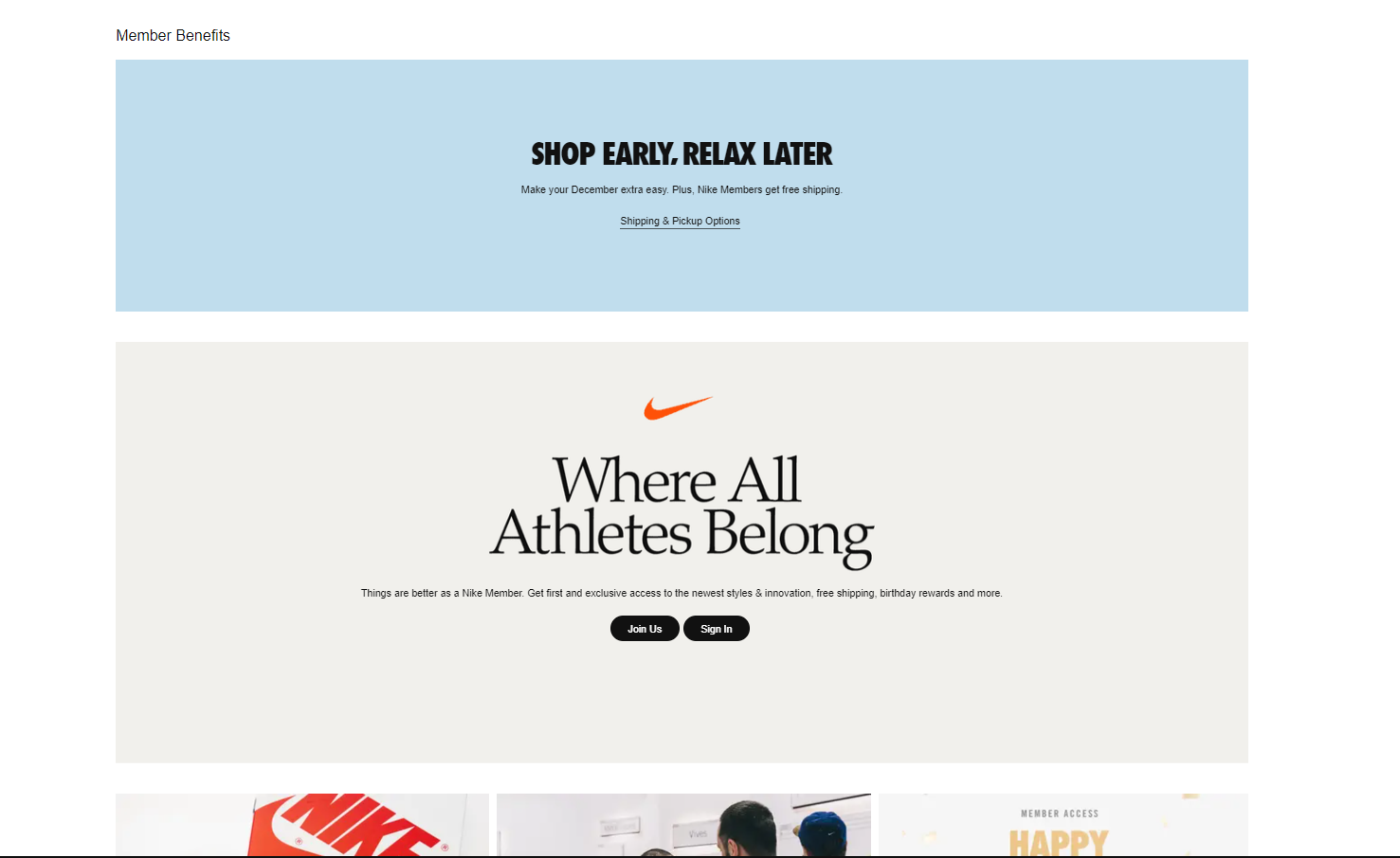
After knowing this information, would you be able to tell what certain brands and symbols are subconsciously doing to you? let’s find out.
https://www.nike.com/

https://www.mcdonalds.com/

https://www.apple.com/

Patterns and Guiding In Web Design
The human brain will also look for symmetry. Symmetry is normal to us, to us symmetry is how we define beauty. Now what would happen if we ruined symmetry? Would it stand out? Would we avoid it? But, what would happen if we were to amplify broken symmetry with comforting triggers such as colors? What then? These are ways you can manipulate without ever even saying a word.
Although having symmetry is the goal, sometimes you may need to break symmetry in order to portray something important, or even just to stick out. While using this denial of calmness and symmetry, you stop the viewers auto pilot. They are now aware and conscious, fully aware of the culprit that caused this. Thinking of why they left this part of the website as is, not realizing or understanding that this is a tactic used to capture your absolute attention.. and it worked.
Well now that you have their attention, what should you do now? Perhaps ways to use colors to stimulate them to continue to your call to action?
Actually, the best way to capitalize on this tactic would be the overall layout and structure of your content. The best way to keep people on your website after this initial capture, is to make the layout easy for them to read and keep track of. Major publishers have learned long ago that readers tend to read or scan pages in a ‘Z’ pattern. Meaning the brain by default will cause you to take this motion with your eyes. The only question now, How do you take advantage of this information?
You continue the stimulation with a call to action, the focus then resets when your call to action has re-directed you to a different section or page of your website. It can even be finished on the first initial click if it is just a landing page. This overall tactic is usually used with marketing and E-COM websites. Although, this is now becoming more of a prominent practice everywhere because of its absolute influence on viewers and consumers. You begin to wonder how many times you’ve fallen into the trap of a really well designed website.
Layout Tactics For Web Design
There are different methods of portraying content, such as the utilization of dead space and of course colors and guiding patterns. But, these are only just a few methods of Web Design Psychology. One common method is called “Mental Models”, which is the process that maps out the understanding and the experience that the models are trying to represent. An example of this is seeing a running shoe in isolation on a web page. Then speaking about how a bad shoe could affect your running, you then will begin to think of yourself running with a shoe that was uncomfortable and that experience that was triggered by the shoe is what caused your mind to interact with their call to action.
Another tactic example would be the “Gestalt Psychology Method”. This Method utilizes the idea of how design elements can be grouped together and used to make patterns that can cause you to associate one element to another just because of the patterns of association that is usually represented with a specific logo or design that this tactic is being used for. This will encompass the idea of proximity, continuity, and closure. Think of different logo’s throughout any industry and you will be able to spot this method being used in all of them.
Another very prominent tactic is the utilization of shapes, this can start from the header all the way down to the font being used in the footer of your website. Some shape utilization would be spheres, triangles, horizontal lines, vertical lines. Now color schemes can be used to amplify these shapes and logo’s to bring on an extra layer of deeper meaning.
Typography And The Importance Of Font Selection In Web Design
Just like any other part of a website, the font is just as important. You can have a webpage dedicated to a worldwide famous MMA fighter and have a quote of theirs on the page, but it seems off. You look and look but don’t understand why it doesn’t give you the same feeling as another websites, until it clicks. You’re using comic sans with these soft curves to represent a fighter who’s words hit as hard as their punch. Now, how to utilize this is matching font types, words and size of your text to match the energy of your presented topic. You want the text to be just as fierce as the fighters words so that it amplifies their original meaning and words. It will paint a picture, and all you did was change the text size and font.
Another method is to keep consistency when it comes to styling. You want your content to be represented in the best way possible. Imagine leading the viewer to this point, using all of the methods previously stated and them getting to the section that you wanted them to get. Just for them to be left with a nasty taste in their mouth for reading something that had so much potential and hyped up with out them even realizing it. They will now walk away feeling upset and they won’t even realistically know why, but they do know it was because of your website.
This is a part one of the Subtle Psychology Of Web Design series, there will be many more issues. Please check out some of our other articles on our blog section here:
https://702pros.com/category/blog/
ALSO CHECK OUT MY SEO ARTICLE:
https://702pros.com/i-dove-head-first-into-wordpress-seo-youll-never-believe-what-i-found/